Create your own small component library
A component library is a set of reusable components.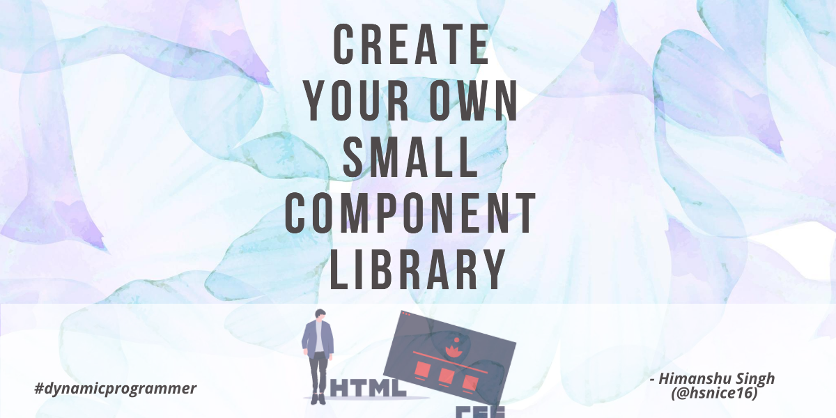
Hello there,👋. In this blog, you will read How can you create your own small component library? And then you can use that for your small projects.
You will find the following sections in this blog -
Final Look: check🚀
GitHub Code: check🚀
Lets we start now.
✔️ typography
The code of typography is the simplest one, all we have to do is write⌨️ only some basic
HTML
.
I had not written any
CSS
for this, but you can write it if you wish.
typography is the art of arranging letters and text in a way that makes written language readable and appealing when displayed.Its code will look something like this -
And finally, it will look something like this -
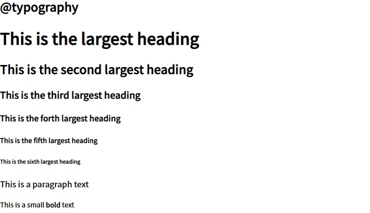
This is all that we have to do for typography. let us move on to our next section, containers .
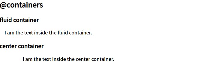
✔️ containers
In my viewpoint, mostly we use two types of containers.
fluid container
:- this spreads from left end to right end.
center container
:- And this, as the name suggests, spreads in the center.
The
HTML
code for containers has only 5
tags
. So you can think, How simple it will be? And 5 tags will look like this -
Okay okay, it has only 3 unique tags 😲.We will style containers, as we have to spread a container in the center. And we will also give them some padding, so they look nice.
Its CSS code will look something like this -
And finally, it will look like this -
We are done with containers too. Let us discuss links now.
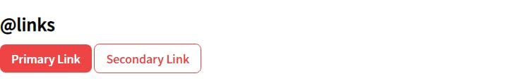
✔️ links
As of my knowledge, basically links are of two types :
The first one is, on which we want users to focus more, known as
Primary Link
.
And the second one is that on which we don't want users to focus more, known as
Secondary Link
.
Writing
HTML
code for this is very simple, we have to include anchor tags for this. And its code will look something like this -
And when we
style
them, using the following codes -
They look like this -
We have completed the links. let's discuss
lists
now.
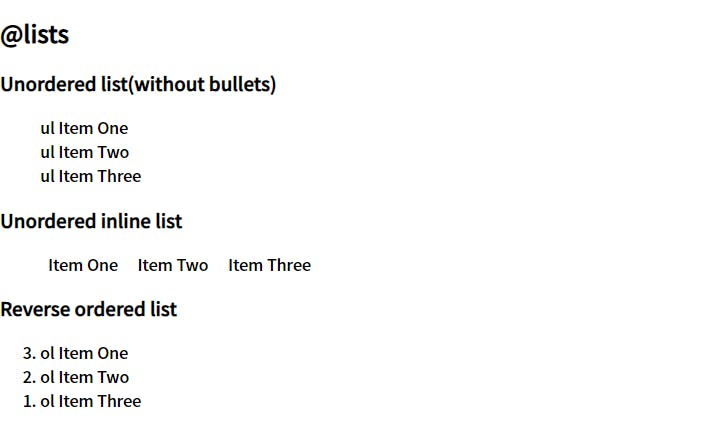
✔️ lists
For this small component library, I added only three types of lists.
- Unordered list(without bullets)
- Unordered inline list
- Reverse ordered list
Finally, it will look something like this -
But with only HTML we will not get the above result, for that we have to add some CSS too. And codes for that is -
We have completed the reading of four sections out of eight 😎. Now let us discuss our next section, which is an interesting one, next is the nav .
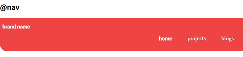
✔️ nav
A navigation bar is a user interface element within a webpage that contains links to other sections of the website.For different links, we can use the Unordered inline list , that we had created in the lists section. Full HTML code for nav will look something like the following -
Mostly through the navbar, users can navigate between different routes on our web page.
The final look of the navbar, that you will see from the Final Look link (above), is like the following -
To get the above styling, you can add the following lines of CSS -
That's all that we have to do for our navbar, now we can discuss our next section, which is the header .
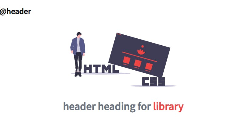
✔️ header
In the header, we mostly use our hero image and add some hero heading.
And for this component library, I did the same. In the
HTML code
for the header, I used an img tag for adding our image and an h1 tag for the hero heading. Codes for which finally looks like the following -
To adjust the image size and to style hero heading, and for their alignment, we have to use
CSS
. Its code will look like this -
In the end, it will look like this -
Lets we start discussing the remaining two sections for this blog. We will start with the
section
next.
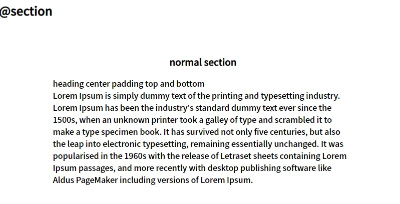
✔️ section
For this small component library, I have included two types of sections. One with
no
background and one with
off-white
background.
They both are center containers, that we had made in the
containers section
.
The reason for keeping them center containers is that it does not seem good to anyone when they have to move their neck to read long text from the left end to the right end. It seems good in the center, they can read it for a long.For HTML code , I have written some placeholder text. The codes are mentioned below for each section separately.
Code for Section 1 -
Final look of Section 1 -
Code for Section 2 -
Final look of Section 2 -
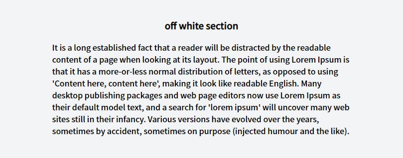
As we had discussed that one of the sections will contain off-white background. So to do that we have to include some CSS . Code for that is given below -
Now lets we discuss the last section of this blog, the footer section.
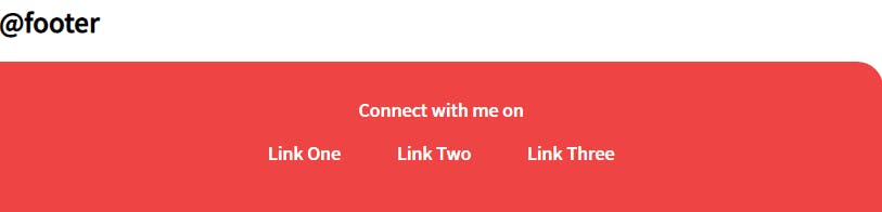
✔️ footer
a footer contains information that improves a website's overall usability.The HTML code for footer is given below. It contains the same Unordered inline list , that we had created in the lists section. And had used in nav .
To style the footer, we need the below-mentioned CSS codes. We have given it some background color , text color , and to give it a little curve shape a top-right radius.
After adding HTML & CSS codes, finally, it will look something like this -
🏁 That's all for this
Thank you for reading it till the end 🙏🏻. I greatly appreciate your patience.
feel free to connect with me on
Twitter
,
Instagram
,
GitHub
, and
LinkedIn
.
Original blog: hashnode